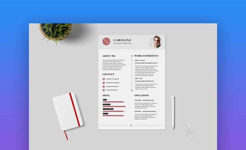
A Curriculum Vitae With Design Or Minimalist?

Do you still doubt between making a CV with a design or not? Although the main coaches insist on the importance of exploiting visual resources, sometimes recruiters prefer monochromatic simplicity: the reason, and the sight.
Streamlining the review of all curricula received is the reason why some recruiters request the minimum style. To avoid immediate dismissal, many candidates for economic-administrative job offers opt for Word templates for CVs.
Design is not an obstacle, quite the opposite; It is a tool to highlight the information required by Human Resources personnel. Here we share the best practices to have a CV without intrusive design.
Design Typographically
Before thinking about the background, use the content as the first graphic resource. The typography can give versatility to the two pages of CV. If you don’t have design skills, play with the characters.
From the typographic choice, define the layout. The objective is to structure the information so that it is readable. To this is added the use of font styles, not regular: bold and italic. These should only be used as markers, just like capital letters.
No Images, No Saturation
Apart from your photograph, you should not include any images on the body. The icons are a good resource, but they should be replaced by an excellent hierarchical composition and typographic games. That is, avoid saturation of the visual field. An icon could divert the visual attention of the text and hardly contribute anything to the style.
An excellent curriculum vitae design (desain curriculum vitae, which is the term in Indonesia), should have a reasoned stylization. In other words, no element should be left over or take up too much space. In summary, the design of a CV should help make the essential data legible to the recruiter. Typography should be the basis of the design, not the other way around.


